Bridgerton series 3
Netflix/Shondaland
2024 - Netflix
ASSISTANT GRAPHIC DESIGNER
Production Designer: Ali Gartshore
Graphic Designer: Nick Smith
Unabashedly a dream job, a dream period and some great challenges to test my skills and grow as a Graphic Designer.
The world of Bridgerton is a heightened Georgian England, this meant a lot of research for period accuracy as well as some creative flair and freedom.


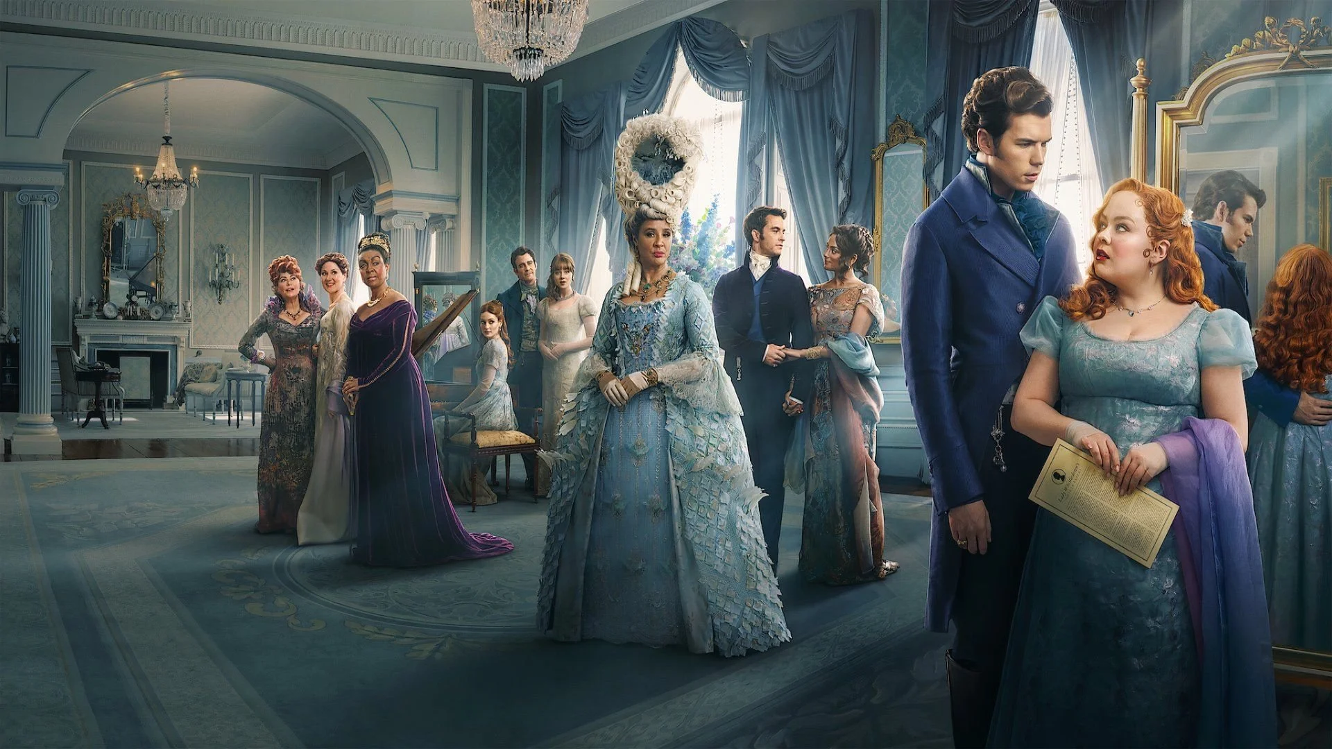
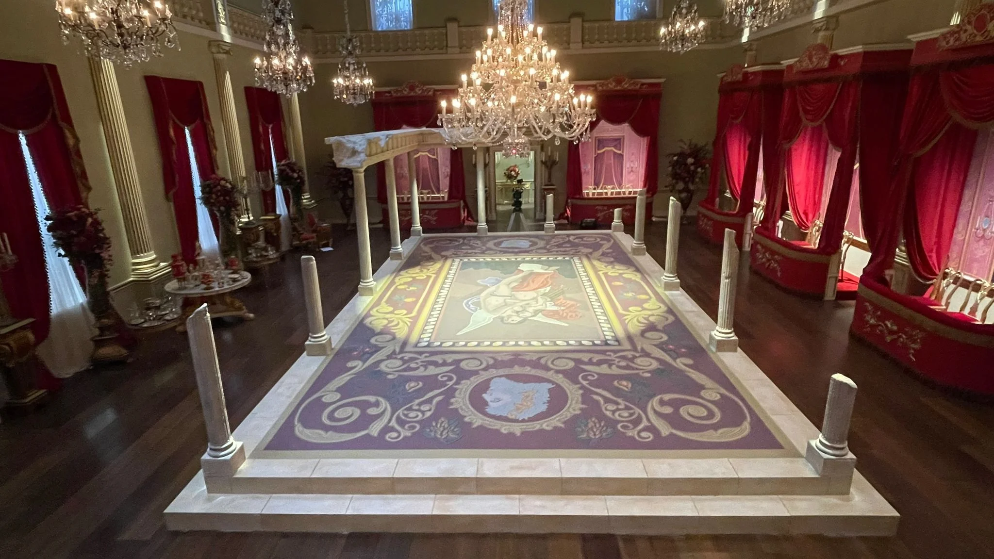
THE BALLROOMS
From the music, to the dancing - Bridgerton is well known for its love of a good Ballroom scene to bring the drama into one room. The privilege of creating the Dance Cards fell to me; each ball had their own theme which I played with when pulling together Georgian decorations and illustrations to create the design. Then digitally colouring them to tie in with the Set Decorator’s intentions.


For the first ball at Danbury Hall, the Production Designer wanted to take the colours and textures from her existing home - dusky pinks and cream/black stone tiling - and bring it seamlessly into her ballroom. We then built upon this to create a striking centrepiece for the dance floor, where the most important action takes place during a Social Season. She pulled from Georgian architecture and decor to add flourishes, Greek Keys and swooping florals which I then vectorised and applied the marble texture.
Given the size of the ballroom at 12 x 8 metres, it was quite the task for myself and my computer. It was also the very first task I was given on the job. I can feel very proud of the result knowing the work that went into it. Big thanks to Lick n’ Stick for the print and install of the Lino!


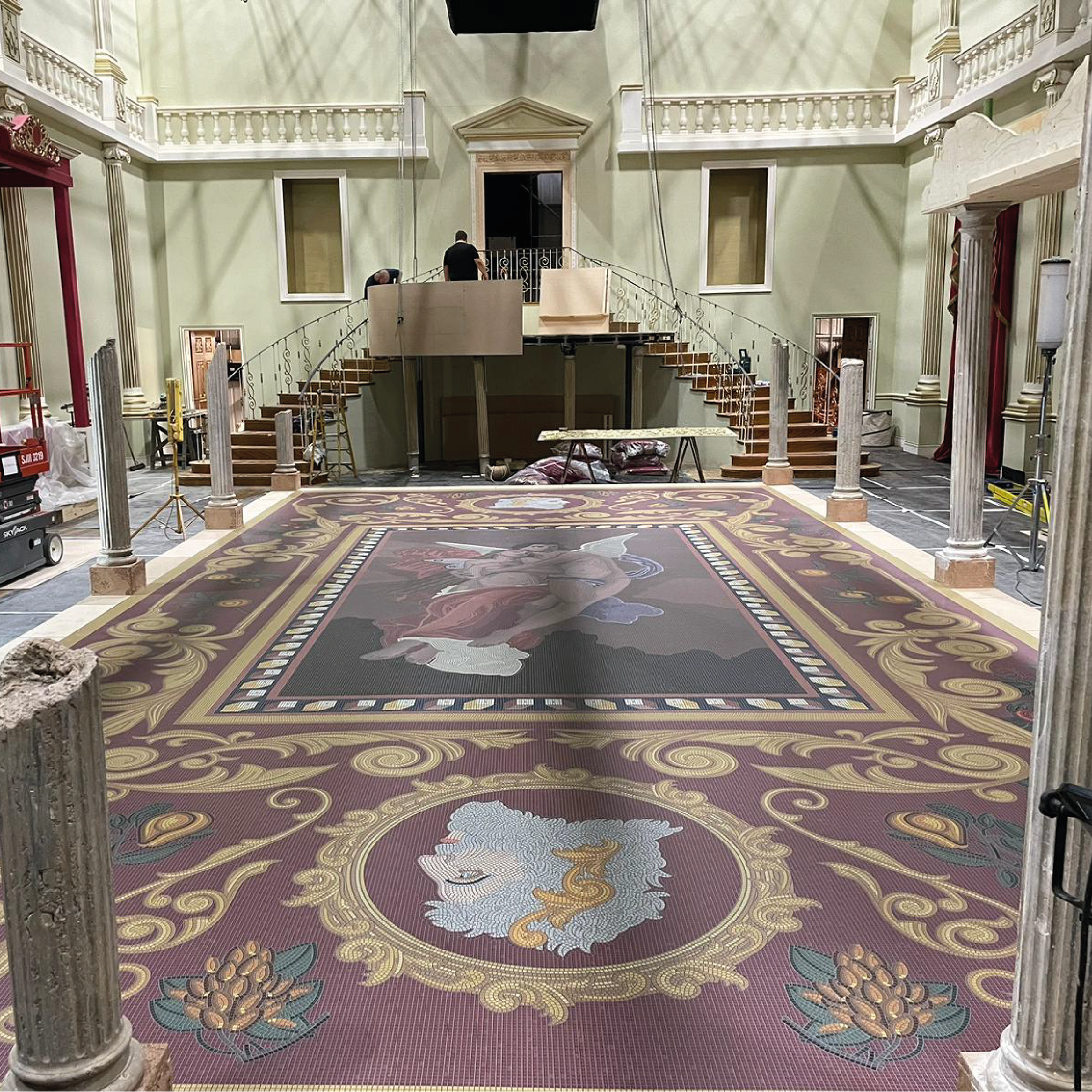


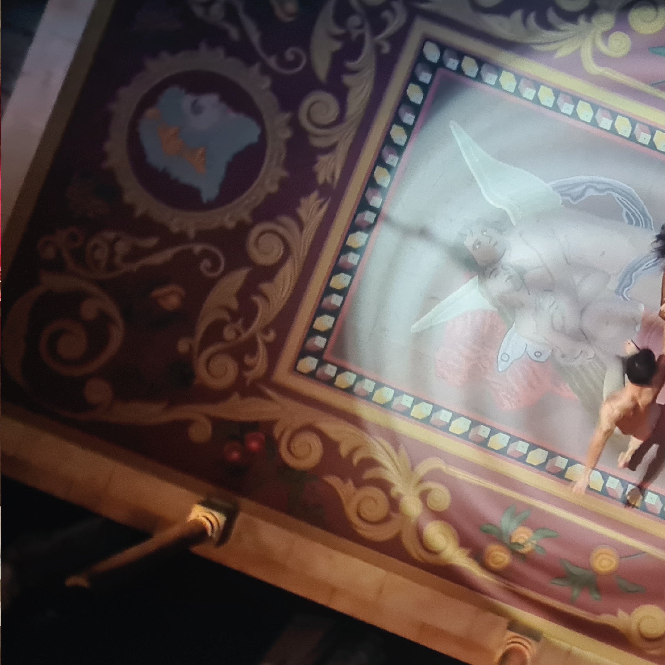

Having achieved the first ballroom floor, I was then also tasked later with one of the final ballrooms of the season. The Queen’s Ball, an infinitely more detailed and complex job. A Greek style platform was built for the Psyche and Eros ballet performance, upon which our Production Designer wanted a mosaic reflecting the story itself. And once again, printed and laid in Lino in order for the dancers to perform safely. This meant a very detailed and time consuming task, firstly to create an overall design and then to turn that into a mosaic. As you can see above, I pulled together elements such as the classical painting of the lovers by William-Adolphe Bouguereau.
Having tested methods and worked out the time and labour it would need to render the full design into mosaic, we reached out to Acme Graphics who kindly took this mammoth task on as we had a very fast turnaround and lots of other work to be done! Thank you to them for the help and to Stylo who printed and installed the Lino!
ACTION PROPS


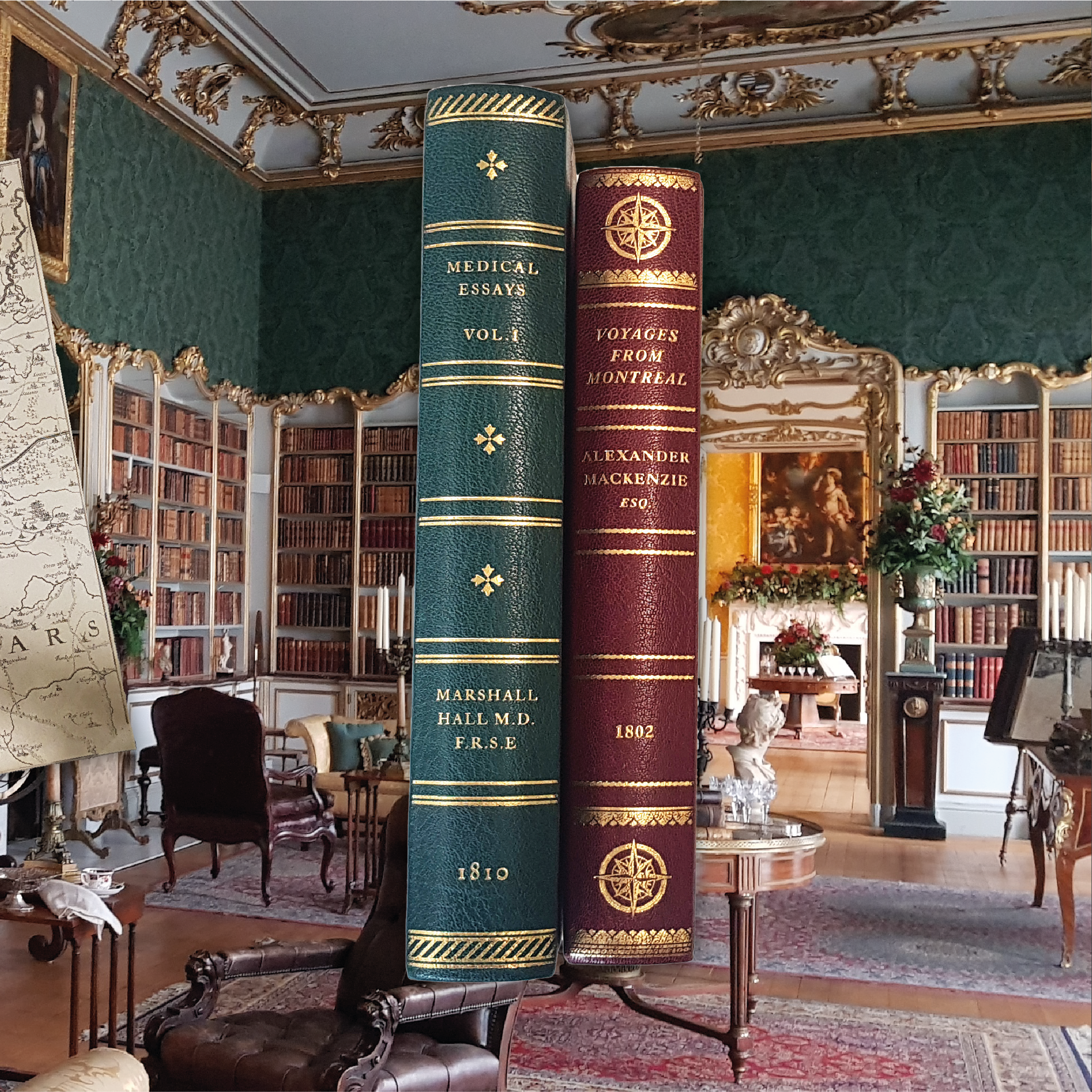


In this season, the Ton visit a Library, a great chance for Penelope to show off her love of books and connect with her potential suitor. For this scene, I designed two books: One for Penelope which was scripted to be about the Northwest Passage, so I found a book published in the time by Alexander Mackenzie called “Voyages from Montreal” that was Public Domain. I then pulled some book plates of landscapes and animals in the area, adding them in for visual interest.
The second book was a medical journal which, in a now deleted script scene, is read by Philippa and Prudence which leads to them figuring out that they’re pregnant - hence the medical plates of various abdomen organs and sections.
The process of designing, printing and seeing the final books come to life was so enjoyable - I think it’s one of my favourite props to make - thank you massively to the ever great Wyvern Bindery for 2 beautiful books!
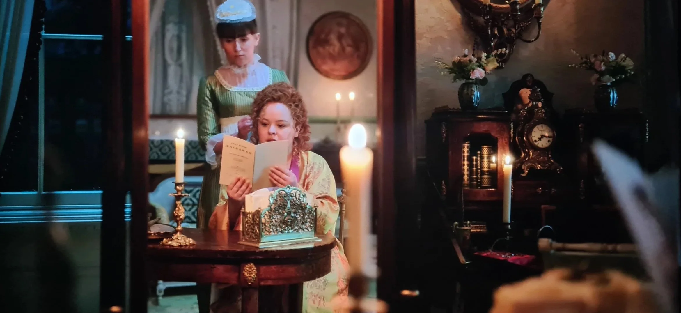
In Episode 1, Penelope decides to try out a new look. This look was very contentious online, with it breaking the conventions of Georgian H&MU. So of course, fittingly, our graphic prop broke the rules too. It was suggested that she might find her ‘new do’ in a Women’s Magazine.
Researching, I came across various women’s magazines but they were of course all like small newspapers. Therefore, to cheat it, I included some pages with articles and a middle section with book plates of ladies fashion and style from Georgian times.
They also wanted an illustration of her desired hair. I traced Nicola’s hair test photos and then sketched that onto a stippling of a lady from a fashion plate.
I was mostly happy with it, however, I think on retrospect the lines and black are too thick and strong against the delicate original.
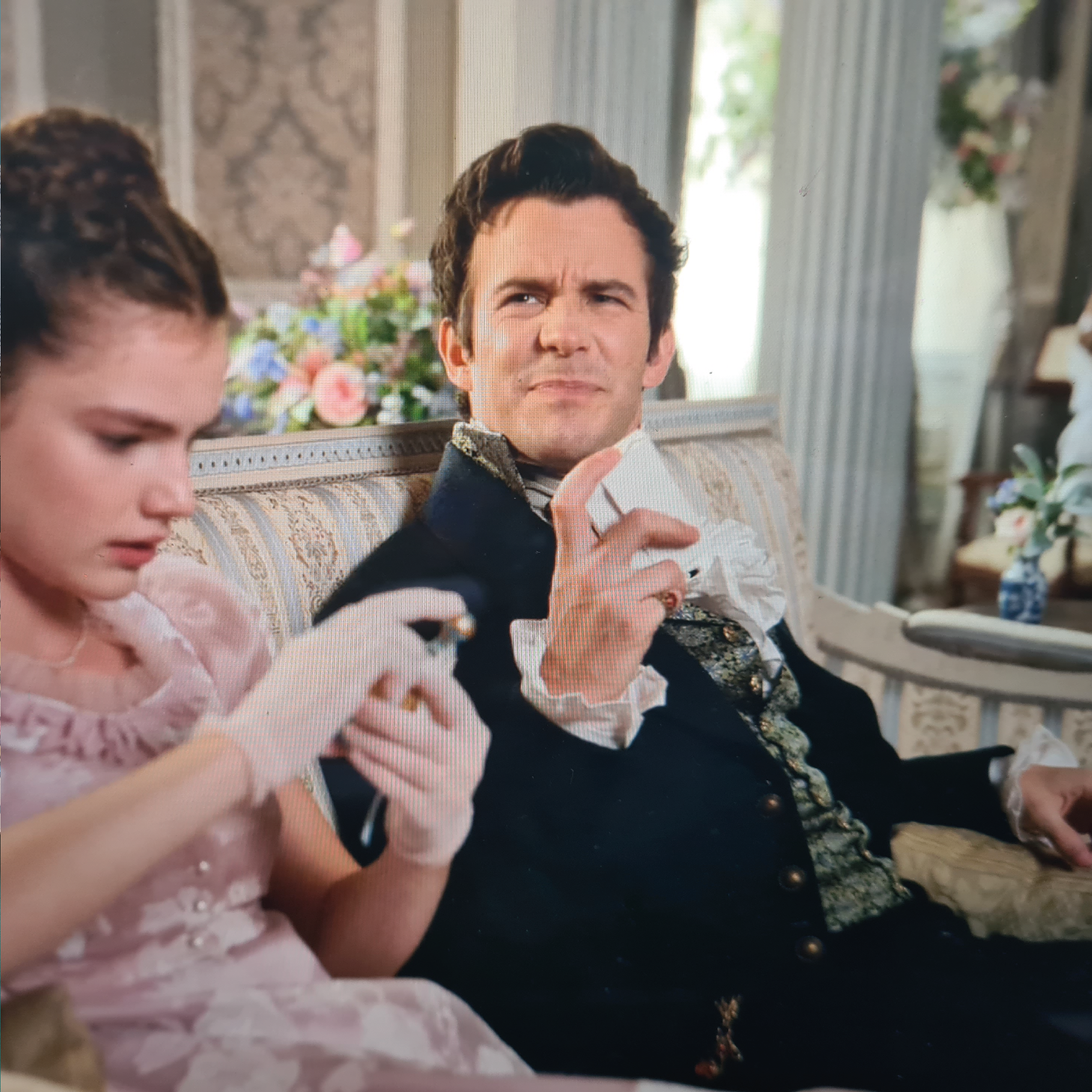
Colin brings back a range of souvenirs from his travels around Europe.
For Eloise, books
For Francesca, Italian Sheet Music
For Gregory, a bow & arrow
For Hyacinth, French perfume
And for Benedict, Spanish Playing Cards.
Although you can’t see the packaging in shot, the wrapping were very detailed with Spanish writing, a monogram for the King of Spain and an etching of a ship at sea.
For the cards, I found scans of traditional 48 deck Spanish cards and fit them to the correct size for the time, then repeated a pattern on the backs for the reverse.